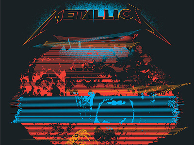
Metallica Poster - Philadelphia 2017
I wanted to do something that felt current and relevant to how things feel in America in 2017. The challenge is that it needed to feel aware of current politics without being too partisan. After all, Metallica’s appeal is really broad and I didnt want it to be something that spoke narrowly. Visually, I pulled from the recent past. Violence and anger as information and entertainment. Distorted flickering CRT TV scanlines scroll and flicker and reveal snatches of vitriolic talking heads, serpents, and ultimately fuse form into a mushroom cloud. The band logo (which we were given a lot of freedom to interpret) looms imposingly over it all but even here the logo is dressed up with facets of bright color, showing that it is both above and part of the angry entertainment. The date and city carry through the visual theme by warping and rolling like an onscreen channel guide distorted by the roiling images under it.

