Spartan Race
My design for The Futur's Spartan Race logo desing challenge.
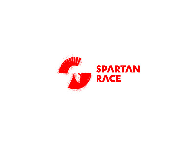
The idea for the logo is to combine a unique S mark and the stylized Spartan helmet into one image. The helmet is placed in the negative space. The top section presents the Horsehair crest combined with the top section of the S, while the bottom section is used to give the helmet it's form.
As far as the typography goes, the original branding used bold type to convey it's message of strength and competition so I felt it was a good idea to carry that over into the new symbol. I made simple alteration to the A, where I removed the cross bar, to mimic the symbol often seen on Spartan shields. It's not as thin as the original symbol, but I felt it added some character to the letters.
Finally I distressed the entire logo, adding some wear and tear here and there with a vector texture. Finally I surounded the symbol itself with the same texture, to give it more character.
All of this texturization was done to mimic the nature of the competition- it's very harsh, often times very, very muddy, dificult to complete and will text your limits. I hop that came across with this solution.
