Stolkramaker 2017 Portfolio Site
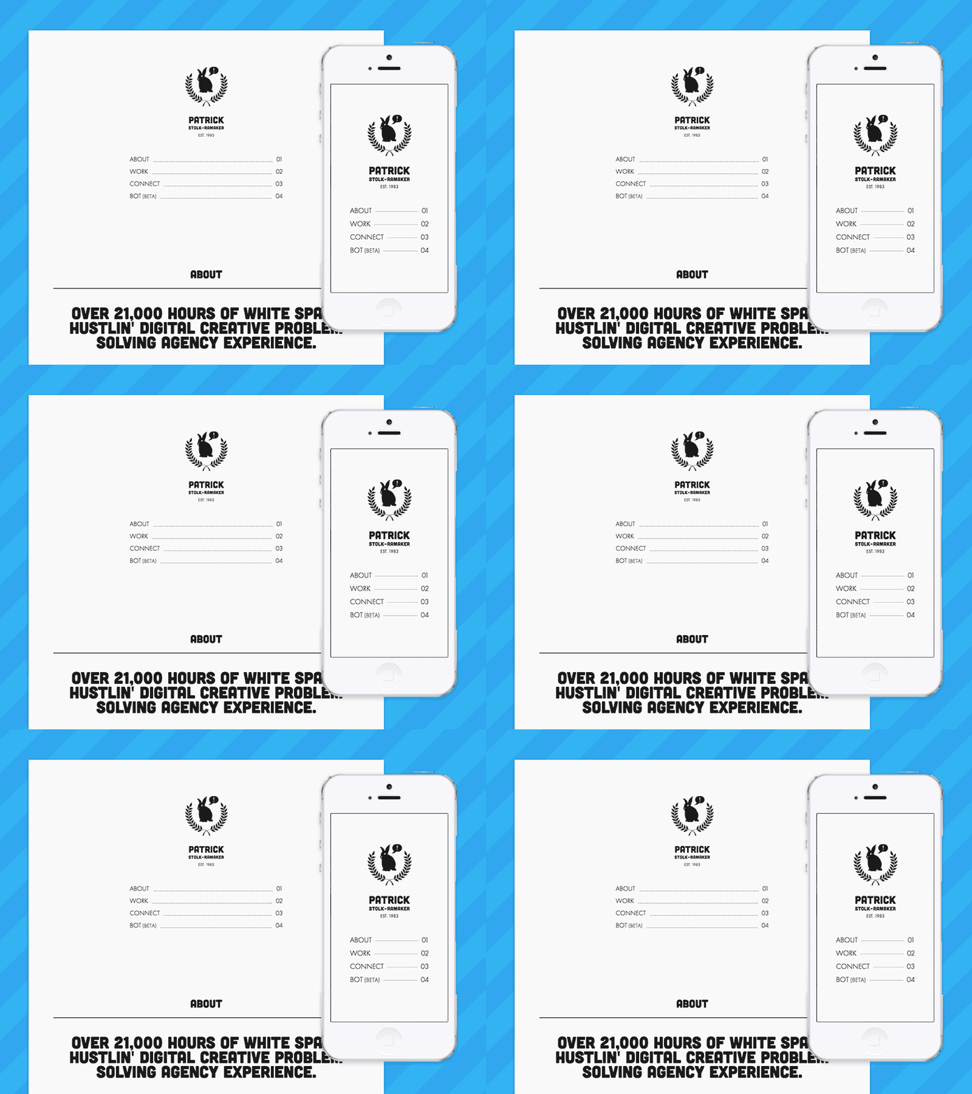
Sifting through all the noise and clutter of heavy visual websites can be overwhelming. In a field where everyone tries to WOW with big impactful pop images, I created my personal site with a simple aesthetic in mind, while still entirely feeling like the stolkramaker brand.
Focused on the primary function of the site, I allow users to learn about me, see my work and finally contact me. Letting the work speak for itself, each image is able to do itself justice without competing with the website.
I am always eager to use design as a part of the user experience as opposed to a layer on top.
More by Patrick Stolk-Ramaker View profile
Like


