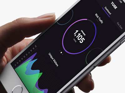
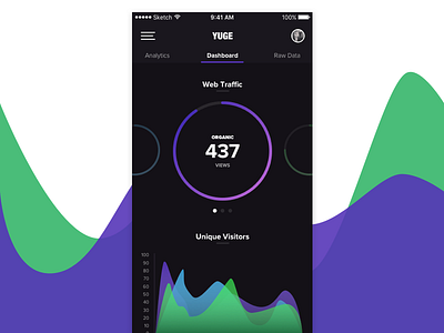
DailyUI - Exp. 018 - Analytics Application - Take 2
Updating this DailyUI 18 with a few small design tweaks:
- Added subtle divider rows behind the graphs
- Changed the font for the header logotype
- Made better use of the large Web Traffic graph colorization
- Condensed the hamburger icon to fit the width of the profile icon
- Changed the selector under Web Traffic to reflect which graph you're on (ie the middle one)
Cheers guys!
More by Mike Dawson View profile
Like


