Marketing page
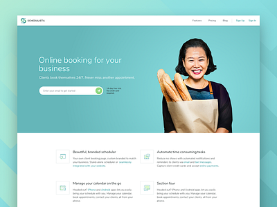
Hey guys! Started a new project recently and would like to share the working process with you. The project is an online scheduling service for many types of businesses. Here's a first design concept of the landing page for the service.
The goal is to design a clean and light interface with a use of blue-teal gradients where teal is refreshing and friendly and blue is strong and reliable. We wanted to represent Schedulista as a young yet trustworthy service on the market. The images here are context-relevant visuals that tell stories of different types of customers who might need the service (e.g. catering, yoga,).
Thanks to @Budi Tanrim for the sweet icon set ;)
Interested in your thoughts about the overall mood of this concept. Thanks in advance!
<3
----------------------------
Available for design work: maria@plainwhite.co
Follow on Behance, Instagram, Twitter
Visit Plainwhite

