Plenum Light
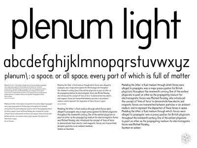
Here's a personal font project I've been pecking at for years. Not sure I'll ever finish it. The readability is decent at text size but I still have to tune the letter-spacing between pairs to get it just right. Originally I wanted to build a font that was a hybrid beteween Futura and Din. Building it from scratch was painstaking but worth it. If you have the time I highly recommend it as an exercise to develop your typographic eye.