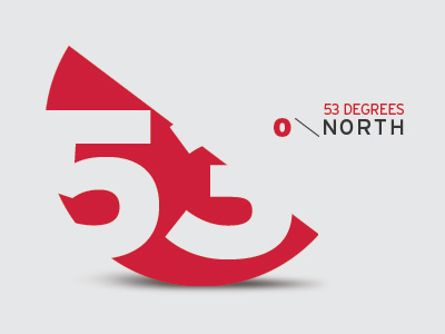
53 Degrees Logo Concept
Hi Guys,
Just wondering what your thoughts are on this… It's a potential new venture for me in the new year based upon my global positioning within the UK. The cut of the circle sits at 53 degrees, as does the divide line between the degree symbol and the text, I'd be interested in removing the text in future and I want something that's graphic and strong, I think this could be very aesthetically pleasing in the bigger picture, applied to print, web etc…
What are your thoughts?
More by Carl Rosekilly View profile
Like
