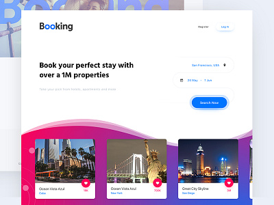
Booking.com - #Redesign 3/15


Heya Dribbble!
It's me again and this time with booking.com redesign.
I think that current booking.com design is terribly cluttered, oldschool and doesn't represent good design work at all.
I did some crazy things, applying gradient waves (is it trendy?), adjusted color and fonts and generally made things more simple.
Note: In this challenge I don't work on the UX/Business goals too much. The purpose is to experiment with visual style and approach.
What are your thoughts, people? There's an HD version for those viewing on retinas.
Cheers!