She Reads Truth v2 - Sprint 1: Bible Navigation
It's been a long while since my last upload on here. We've been focused on other areas of the company and some other huge projects, but it's finally time to circle back on our bible app with a full redesign.
We're working in incremental sprints and I will try and post a shot per week to keep things up to date.
Sprint 1 - Bible Navigation
This sprint will address how the user consumes content in the Bible section. This is really limited to reading and navigating. Future sprints will focus on interacting with the text (notes, bookmarks, etc.)
Two major influences come into play for this sprint:
1. Physical ease of interaction
2. Transparency in functionality
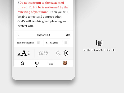
In response to larger mobile devices and in an effort to reduce thumb reach, all navigation is moving to the bottom of the app. Here, from this tray, the user can navigate anywhere in the Bible, set readability preferences, and navigate to other sections in the app.
Based on our user surveys from v1 of the app, there was a lot of navigational confusion with our hamburger menu. This new approach will keep navigation in front of the user, increasing their navigational recall.
