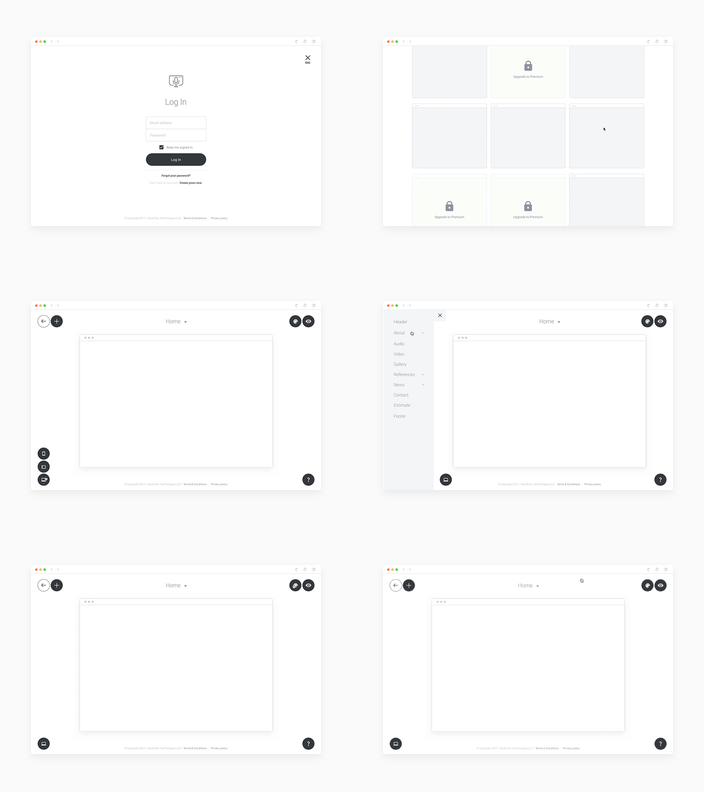
Low-fidelity UX prototype for a website builder.
Exploring low-fi concepts for a website builder.
Many UX issues are invisible. They need to be used to be discovered. That's why a low-fi prototype is way to test assumptions quickly.
Also, designing in black and white will keep the focus on solving and designing the core experience of your app. Color evokes strong emotional responses and often interrupts our ability to focus on the core design problem.
Cheers,
Alex
___
PS: By applying these 3 UX principles to your product, you can improve the customer experience up to 30%.
PPS: And if you are a growing-stage SaaS company or a startup, check this to learn how your company can get an unfair competitive advantage with UX strategy in just 3 months.
___
More by Alex Gilev View profile
Like
