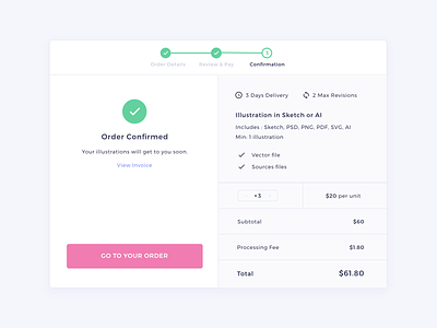
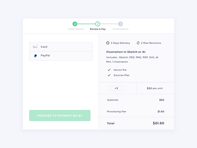
Confirmation | HexGig
I missed a divider in my last shot lol. Anyways, I decided to use green to distinguish the payment flow, but I use a pink button to go back to the other website features. The website’s primary colors are pink and purple.
More by Charles Marino View profile
Like


