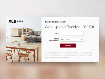
Daily UI challenge #026 — Subscribe
I decided to redesign Muji's email newsletter sign up page currently found on their US website.
Thoughts and challenges:
Increase sign up rate by providing an incentive to sign up (10% off is currently offered on their Facebook page).
Remove unneeded input boxes to reduce the time it takes to sign up.
Rearrange content areas and form layout.
Use a module so it can be added to any page.
Keep the current typeface (Helvetica).
Add some type of imagery.
Use the golden ratio to divide up the image and content area.
Keep design consistent with current look and feel.
Enjoy!
More by Chris Ota View profile
Like

