Women Visionaries
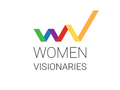
Strength and diversity - The meaning behind the WV logo
---------------------
www.women-visionaries.com
Women are often taken as the softer or even weaker gender. Companies and designers therefore often decide to take very soft edges and colors and thin strokes.
We wanted to go a different direction and communicate strength, potential and empowerment. But also diversity which we emphasized with the high variety of our colors.
It is the first time I have created a logo that has more than two colors. It is quite a challenge but so exciting to do. You have to be aware of so many different color contrasts and still being able to communicate the right meaning behind it. A slight change in saturation can be the difference between strength and dark theme."
We love the diversity behind the logo so much, that we have confused you with the color arrangement of rainbow colors. We love LGTB, this is part of our diversity, but we don't want to exclude anybody else. Therefore we decided to re-arrange the colors and tweak them a little bit.
The result is what you can see here. Now we have colder colors for the W and the warmer colors for the V. One can say this logo is steadily warming up and empowering itself. We purposely decided to give the V (Visionaries) the bright and warmer colors, since this is what we are going to create. Visionaries. An inspiration for all women.
The elements of the logo consist of bold strokes creating wv with v having a longer stroke upwards to the right. It implies strength and growth which is important for women in order to become their own leader. The word-logo below it has got a new color: Black instead of grey. Here again, we want to communicate a strong personality. Black suits better for this purpose and is considered to be more elegant.
