Halo Burger Rebrand
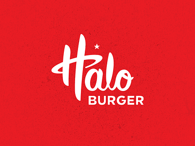


Change can be hard – especially for customers of beloved brands. So when Halo Burger came to us for a rebrand, we began with a logotype that felt authentic to the people who cared about it most: loyal customers, who had been there since the beginning. The update carries the weight of the brand’s heritage without showing its age.
The refreshed identity still features core characteristics of the previous logo, reimagined to reflect the brand Halo Burger is today. A big part of Halo’s heavenly persona was the halo and star combo; it had been overlooked for a while, so we brought it front and center. The iconic cow has also been rejuvenated with a fresh look that complements the angle of the Halo and the weight of the logotype.