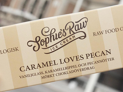
Sophie's Raw
Sophie's Raw makes hand made ice cream in Sweden and came to me to create an iconic lettered logotype which represents and visualised the craft. Next to the toughness of balancing the swooshes on the "S,H, R and W" I had a hard time finding ways to include the "Food that matters/Ice cream" slogan within the logo but after all it really worked out for both me and the client. Really satisfying to see the lettering in actual use on the packaging! (see attachments)
More by Paul von Excite View profile
Like


