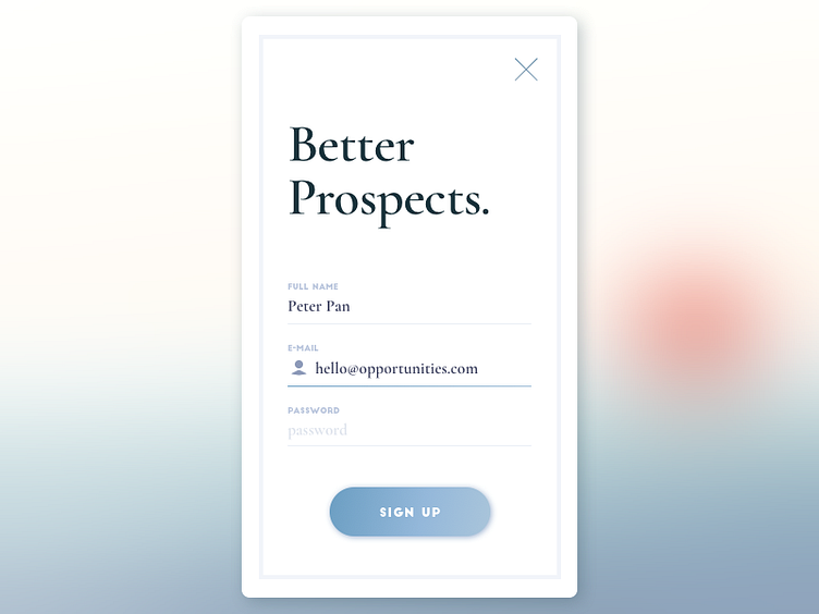
001 Daily UI
As a product designer, I spend a lot of time working on the same thing. That means there's not a whole lot of creativity involved once your design system is defined. That, coupled with the fact that my visual design skills need some work, I've decided to start doing Daily UI (again). Hopefully I have the motivation to see this through to the very end. Here's to 1 out of 100!
I wanted my daily ui posts to be witty and out of the box, but this one turned into some sort of career seeking app 😅
I imagine this to be the second screen of a sign up flow, so I decided to omit the button to sign up with social media (which should be on the first screen). The close button in the corner also lets me omit a link for users who already have an account.
Thoughts, feedback, likes all welcome!
