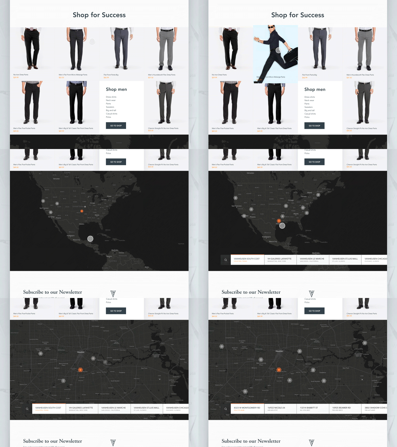
Van Heusen Homepage - Scene 3
Hey guys,
Here is another example from VanHeusen’s homepage. We’re discussing internally how helpful or disruptive the use of ‘entertaining’ motion is on retail websites. Does it increase conversion, draw attention to the product, or distract you from the content? What are your guys’ thoughts?
Cheers!
More by FΛNTΛSY View profile
Like
