InVision - Design Education Project
Over the last few months, we’ve been working on an (as of yet unreleased) special project around design education. The project required a unique visual identity system to unite all elements of this new brand.
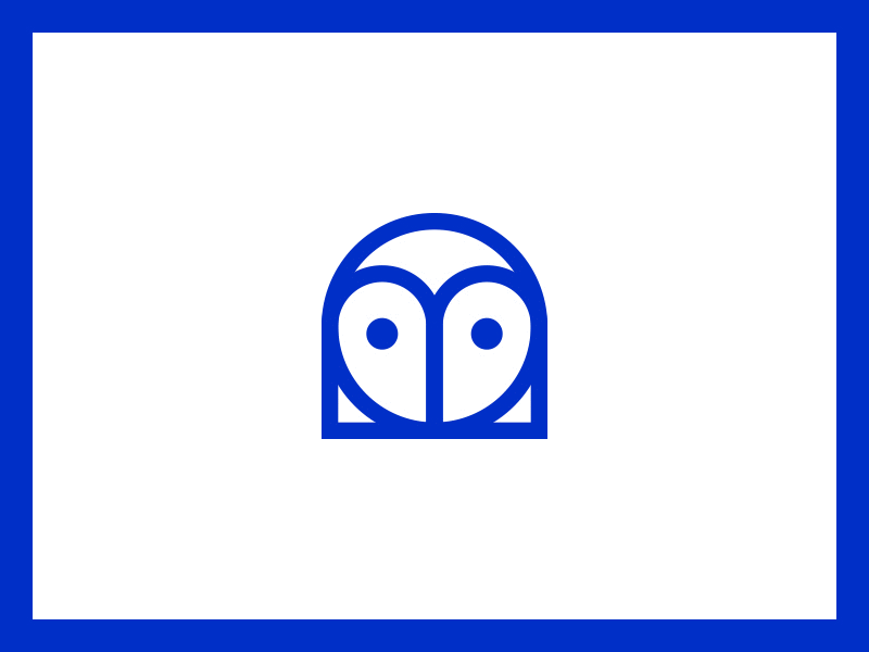
The owl brand mark - seen in this shot - is formed out of a rotated D and B (the first letters in the brand name — any guesses?!) We chose an owl, as it represents ancient wisdom. Additionally the system employs a custom, decorative typeface that metaphorically symbolizes building blocks when used together.
This project was a team effort and we’re excited to share it with you soon. Stay tuned for more info!
Press L to show some love Follow the InVision Team Not collaborating with InVision yet? Sign Up - Free Forever!