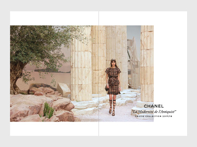
Chanel Cruise Collection 1/7 — Editorial Layout Example
I'm crazy about good photography on white pages with minimal typography, so my editorial design style always ends up very clean.
When I saw Chanel's new cruise collection, I just felt like putting these amazing photos on spreads and make a sort of leaflet/catalogue/magazine showcasing the fashion show.
Hope you like it.
More by Beatriz Fialho View profile
Like
