24eat
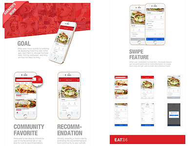
To help users move quickly to ordering an appealing meal they see in the app, my design refocuses the search field box and filter to toggle with the current tabs so that the screen is less cluttered and the hierarchy is featuring at the top the search box. less is better so this design navigates user faster to Whats Good, which is why they use YELP.
More by Asenath View profile
Like
