Danger Toasts
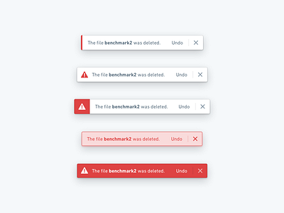
Visual iterations of Blueprint’s toast messaging system.
In order to maximize accessibility, we went with the last option: we rely on both strong contrast and iconography to convey the intent of the message. We also use motion to draw attention to the toast when it appears and disappears.
More by Palantir View profile
Like

