Tulsa Flag
Tulsa flag redesign concept:
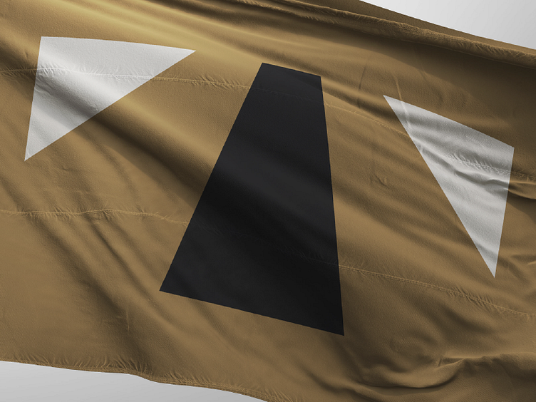
The black shape in the center represents an oil well, signifying the major economical role that oil has played in the city.
The gold background is a symbol of the opulence of the Art Deco style, as Tulsa is home to one of the nation's largest concentrations of art deco architecture.
The black and white shapes are converging toward a unified endpoint, symbolizing the process of racial reconciliation after the infamous Race Riots of 1921.
The black shape also represents the Mother Road, Route 66, carving its way through the golden Oklahoma prairie landscape.
And the whole thing comes together to form a letter T, an homage to the city's seal and current flag design.
My goal of the flag was to keep the overall flag design simple (so simple that a child could draw it from memory), symmetrical so that it would read the same from both sides, and scalable so that it would reduce well to smaller applications such as lapel pins and business cards.
