Optimizing Wix Sign Up Page Pt.2
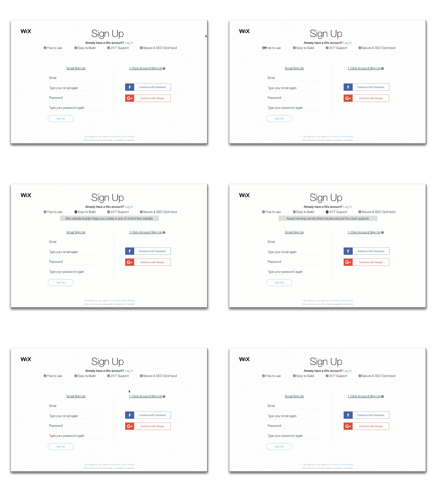
+ Wix has a beautiful site but too focused on minimalist design and not enough on Conversion Rate Optimization. + Trying not to break from minimalist design I included some simple text with a uniform icon that you can hover over with extra details. + Also included an area where a person can better understand what is a Facebook or Google signup ability. + They have a straight forward sign-up page which i understand is meant to make people just plow through the process without thinking but they're asking a lot from people. They don't include any 'why' in regards to why people should sign-up. What are the benefits? + Also a CRO flaw was when you click sign-up on their homepage it starts off as a login page and you have to a text hyperlink button in blue that says "Sign Up". If someone clicked the "Sign Up" button on their home page it should go straight to the sign-up option, not the login option.
