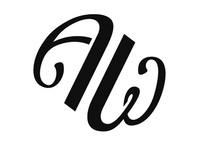
Art=Work Round 2
Added thicker strokes to the letterforms, while making the equals sign thinner. Also, completely reworked the “W” to read easier, and balance the shape of the “A” better. What do you think?
More by Nathan Ford View profile
Like

