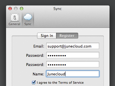
Notefile Sync Preferences
I needed a cloud icon for Notefile's sync preferences, so I figured I'd repurpose the cloud I was playing around with earlier this year. I'm not entirely sure this is final, but I'm pretty happy with it.
After working on this, I can understand why so many cloud icons look similar. Three or four puffs is about the most you can get away with and still have it work at a small size, without just looking like a blob. A flat bottom helps give it some weight and definition—and helps it fit in with other icons that are likely to have more hard edges. I tried to make mine a bit different, and I like how it came out, but I do wonder if a more "standard" cloud icon would work better.
I've been surprised by a lot of things working on my first proper Mac app, but I was completely dumbfounded to find Apple doesn't offer an easy way to create this style of preferences window. Fortunately MASPreferences made it simple.

