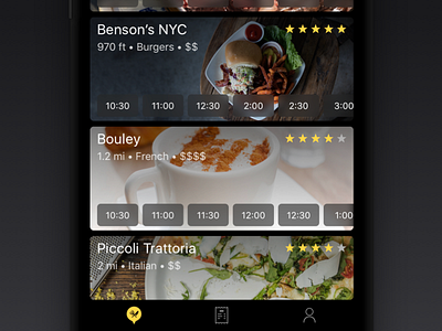
SwiftDine
Like this shot? Press the ❤️ Like button and Follow me on Dribbble to see when I post the next shot!
Follow me on Twitter to keep up to date with my rants and thoughts!
____________________
Hi there,
I'm super excited to show you a project I have recently worked on. The core idea was to transform and innovate on the current experience of eating out so that instead of waiting for a table, ordering and waiting, you can just pop in the venue, your food is ready and you can enjoy the time with people that matter to you the most! One of the great side-effects of the businesses who use this services can turn the tables around 55 minutes faster, thus get more customers in and increase their revenue. It's a win-win situation!
Our UI got a dark treatment to accommodate for the main use case and increase usability when using the app indoors in the evening. Not only it makes it stand out from other apps that are mostly light themed, the app blends with the device and UI just becomes chrome that it's not in the way but it's there when you need it.
I really put my heart in this project and gave attention to every bit of the experience - starting from venue discovery, group purchasing through smart notifications, that let you know when it's good, to go to little details like the option to get Uber or Lyft to the venue. Same goes for the paying, reviewing and tipping experience – not to mention smaller use cases like ordering more when at the venue. Not a single bit was left unturned. As a result, you get a streamlined experience that doesn't just address the main pain points but delights along the way. 😊
I can't wait to show you more of the app in the coming days. If you read this far, then please follow me on Dribbble and Twitter to see when more of this drops. Thank you!
And as always, any constructive feedback and your thoughts go long way. 😉
