My work section | New portfolio
When I was creating my new website, I wasn’t sure about the style and look of it. Should I go with black background? Or white? Should I use more colors or less colors? I’ve decided to go with black version first and I think it was working very well right from the start. I don’t use many colors, only on hovering over the projects which may seem a bit sad but I believe it fits into the rest of the page.
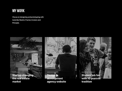
I also had to decide whether I want to show some mockups and screens or use photos instead. I went for photos as, again, it works much better with the set style. I didn’t have much time to work on case studies for each project so they lead right to the webpages right now.
When I was browsing other 1st May Reboot websites I found out that my decision was right. There was a lot of similar websites with white background but almost none with black background - I am happy about that :)
Check the live version here: www.seitler.cz
---------
Get in touch
Twitter // My illustrations on Instagram