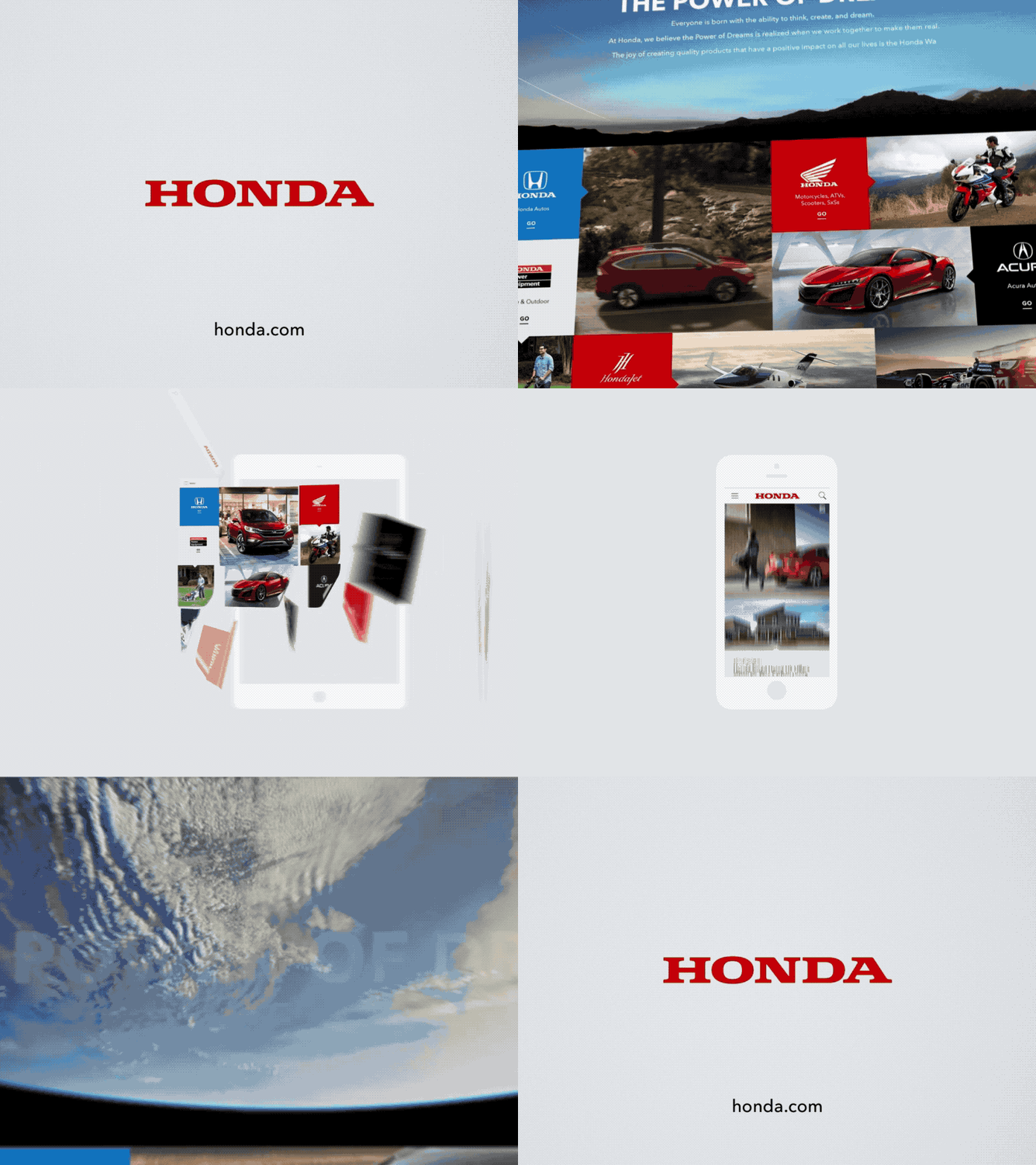
Honda.com
Honda.com hadn't been touched in years. Many years. Nearly one year later, a brand new online presence had been reimagined from the ground up. Expressed through a the concept of modularity, rich and immersive content was crafted around this framework. Brimming with vibrant motion and an overall progressive app like experience for users. Language and messaging was a key focus. Honda could finally tell it's brand story, sharing its drive behind brand pillars such as innovation, environment, and the future of mobility.
----
Typography
Strong and balanced typography build the foundation of information throughout the experience. Balancing color, weights, and type cases help present a tone of power, friendliness and progressiveness.
White Space
White space is a powerful tool throughout to create focus and comfort. A color palette bursting with life contrasts this beautifully anding vibrance and excitement across every page.
Imagery
Big, beautiful, and aspirational imagery is the key to elevating our messaging to aspirational heights. Content of the highest fidelity inspires the imagination of the viewer and maintains high engagement throughout the experience.
----
The scale of effort involved is hard to convey, or the range of aspects that this project touched throughout it's journey. In the end, very happy to have worked with so many talented partners in bringing this to life.
----
Only so much can be shared thought a Dribbble post. Please visit Honda.com to explore the experience.
----
Proud to announce that Honda.com has received the Addy Gold Award.


