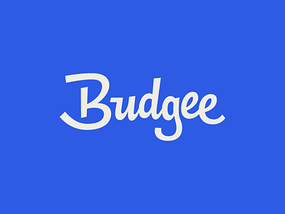
Budgee


We've made a bunch of refinements to the Budgee script since we last shared it.
Previously, the script seemed a bit unsure of itself—was it intended to be mono linear or have some contrast? As we kept working on it and took into consideration everyone's feedback from the last shot (thanks!), we wanted to make the contrast feel more intentional and mimic a painterly quality.
The other big change was in ditching the bouncing baseline. In losing the bounce, we could create an implied arc beneath the logotype (because of the and last dipping below the baseline) that felt really optimistic.
Lastly, to pull everything together, we unified all of the letter's lean/angle. Previously, they all had a bit of a lean to the right, but they weren't consistent. In making them all upright, the logotype didn't loose any character (in fact, I'd say it gained character!) and made it unique in comparison to most scripts which have a natural lean.
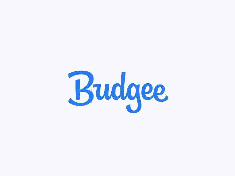
Check out the attachment for a static version of the logotype and to see all of the iterations overlaid one another.
@Matt Yow and @Sam Stratton are crushing this project 👊🏼