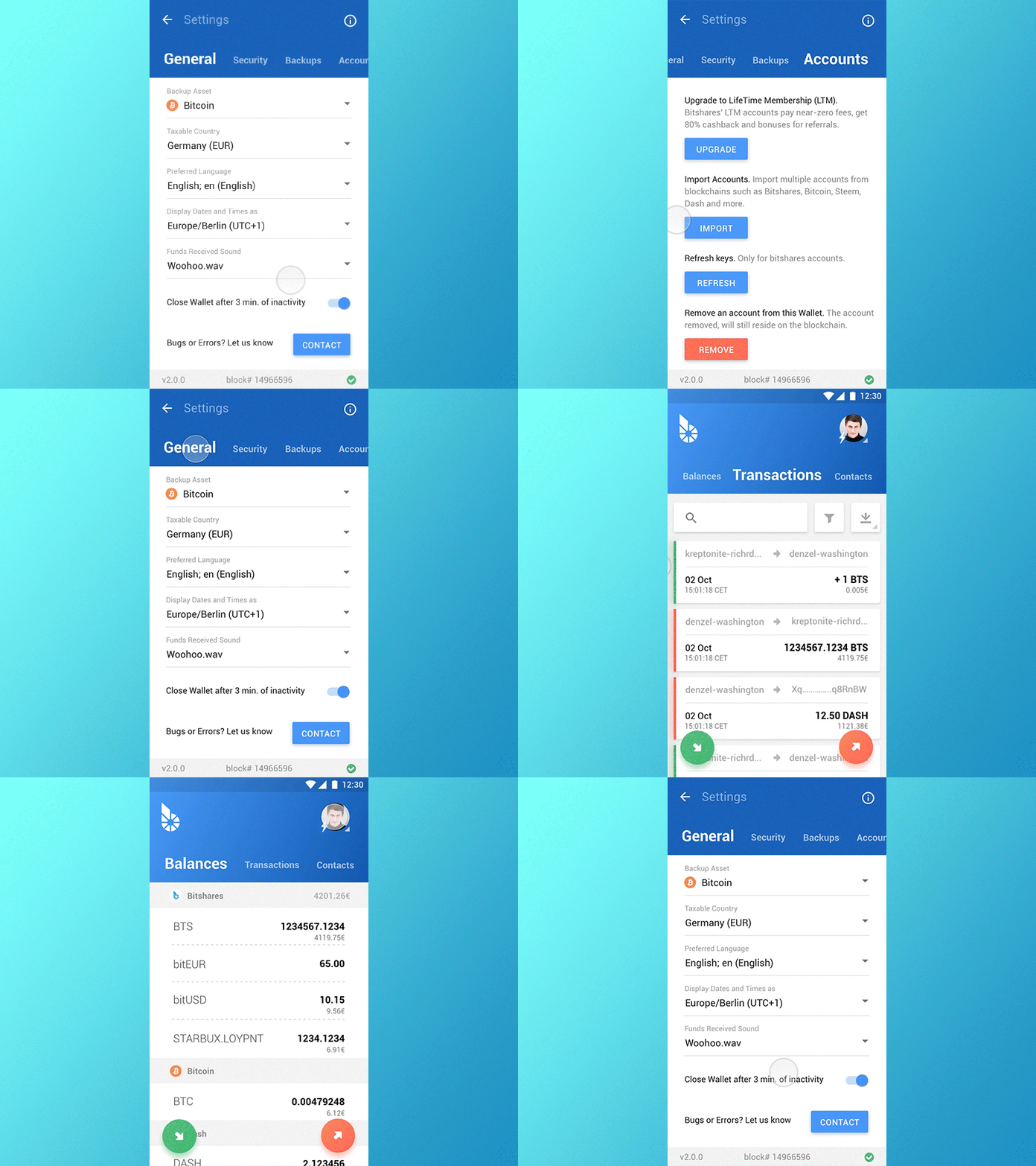
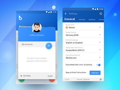
BitShares Munich. Carbon. Accounts / Settings
Hi all,
Initial idea behind this interaction was to make the app as responsive and fluid as possible.
Settings are not something that users assumedly would require to access very often so we decided to move it down the account dialog box. At this point i've posted quite a few pieces of this app so that's probably enough explanation by itself.
I'll be publishing updates as i go forward towards the interaction and motion design stage so stay tuned.
Thanks for hitting "L" if you like it, this will motivate me to keep coming up with more colorful stuff! Cheers! :D
More by Yaro Zubko View profile
Like

