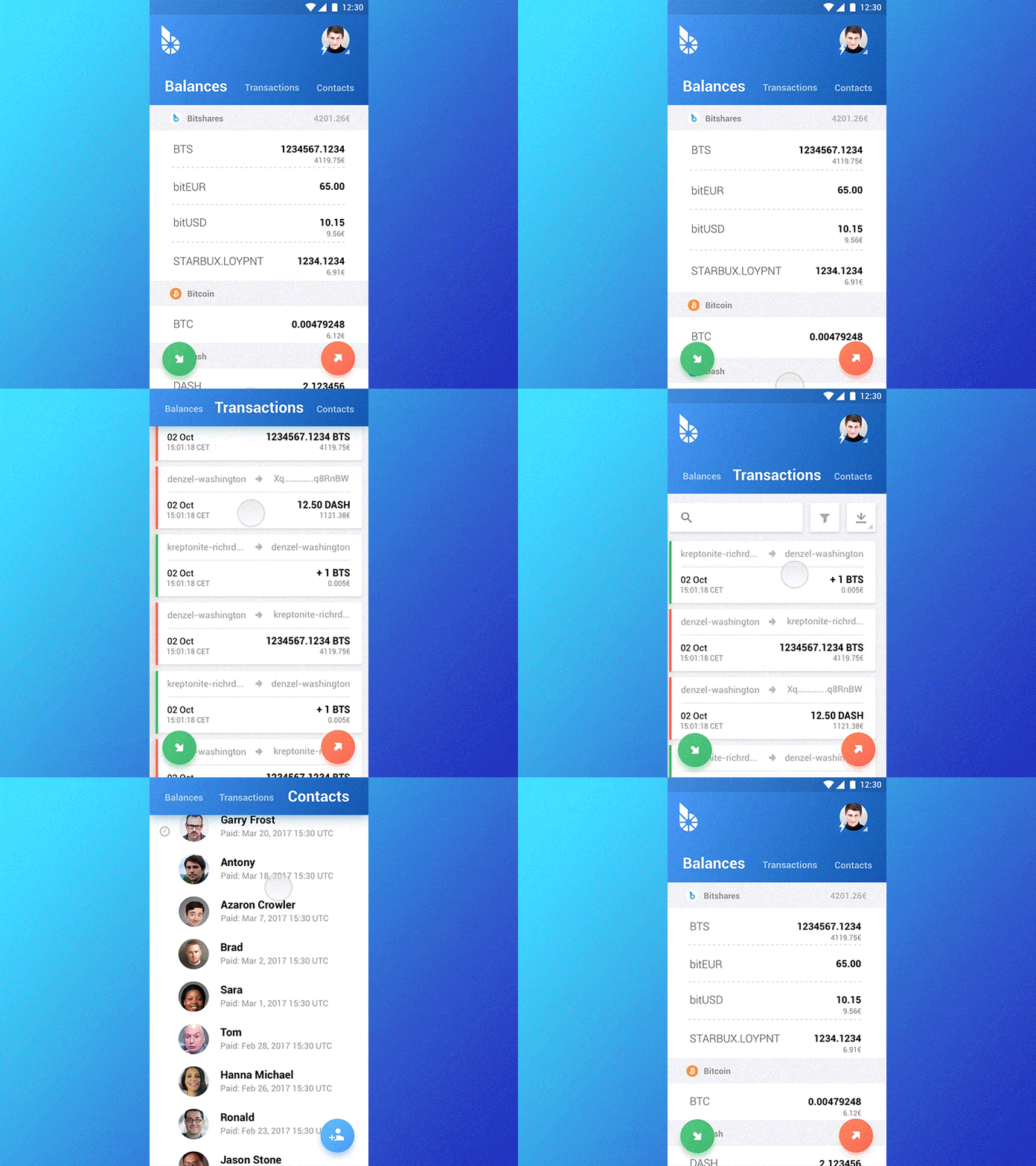
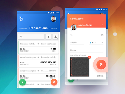
BitShares Munich. Carbon. Section switch interaction
Hi all,
Finally, it got to motion design. Initial idea behind this interaction was to make the app as responsive and fluid as possible.
There are three main sections of the app, user's balance, their transactions and contacts. Given the issue of large mobile screens, of-course i wanted to make it maximally accessible so users could just swipe between without having to hold the phone with the other hand.
I'll be publishing updates as i go forward towards the interaction and motion design stage so stay tuned.
Thanks for hitting "L" if you like it, this will motivate me to keep coming up with more colorful stuff! Cheers! :D
More by Yaro Zubko View profile
Like

