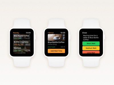
Wait – Add Waiting Time Flow (Apple Watch)
Hey Dribbblers,
Thanks for checking out my shot! I am continuing my 'posting old projects' challenge and today I am sharing the Add Waiting Time flow from the Wait watchOS app that I have worked on in 2015.
The watchOS version of Wait took the simplicity of its iOS sibling even further and all the features were stripped to the bare essentials, taking in account the short time people spend interacting with watchOS apps. As a result, discovering venues with shortest wait times, viewing venues and adding wait time is super quick and easy. The app looks familiar to its iOS counterpart, yet inherits to the watchOS HIG and platform conventions. A lot of the designs decisions made when working on the watchOS app inspired me and my client to cut out unnecessary features from the iOS app – you should try this too!
When working on a product, challenge yourself to design a watchOS version. It will make you really think what are the essentials, what are the core features of your product that your customers really need. (Yes, there are certain exceptions that this won't work with - e.g. media heavy apps, content heavy apps, etc. However, it's a great exercise nonetheless.)
Check out the attachment to see all the pixels in their glory.
Like this shot? Press the ❤️ Like button and follow me on Dribbble to see when I post the next shot!
Follow me on Twitter to keep up to date with my rants and thoughts!
And as always, any constructive feedback is appreciated. 😉
