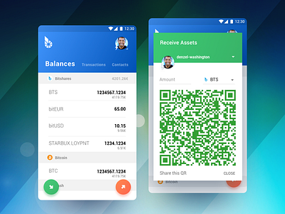
BitShares Munich. Carbon. Comparing interaction patterns
Hey there,
Here comes another piece of Carbon Wallet. Initial idea was to make cryptocurrency even more accessible and the wallet itself more intuitive.
I've finally got to my of my favorite stages of the process, micro-interaction and motion design. I've been playing around with different ideas of how to approach it and so decided to share some findings. Currently im contemplating these two ideas, the winner will probably define the motion language for the rest of the app. Each of those has its pros and cons.
The left one is faster and so may fit better if there's not much data to upload from the back-end (which may cause some extra lagging). The right one is more suitable for material design approach, takes more time but accounted for the data being processed properly.
Im curious to see your suggestions friends, keep it coming! :)
I'll be publishing updates as i go forward towards the interaction and motion design stage so stay tuned.
Thanks for hitting "L" if you like it, this will motivate me to keep coming up with more colorful stuff! Cheers! :D

