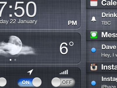
iPad Notification Centre
Currently the solution for the iPad’s notification centre (NC) is a little confused. Using the infamous ‘linen’ texture as an overlay makes absolutely no sense. So I got to work on solving this issue by making it recessed under the content the same as the Multitasking tray (MT). This creates the illusion of it working in the background for you – much in the same way as the MT.
I thought I’d take some creative license by giving it a few different gradients and styles. This, to me works well. It’s subtle, yet familiar, stylish and intuitive. Putting the notifications on the left and the time, date, weather and quick toggles on the right makes using the NC more intuitive and necessary if you want to quickly switch something on or off (much in the same way you are allowed to do when prompting the MT and swiping to the left to see the volume, brightness, Airplay / Music controls.)
My aim is for someone working at Apple, or even someone who knows a guy who is friends with a guy who works at Apple to see this and understand where I’m coming from. I’d love to see something like this realised. I want this to be reality because at the end of the day, user experience is important to me as well – and this answers a lot of questions and expands the usability of the feature whilst tying it together nicely with the sense and thinking behind the usage for the linen texture (being a ‘behind the content’ background image.)
See what you think. Please spread this message and get it out there to as many people as possible – lets make this happen!
For Full see here:
http://www.iphaze.com/2011/12/ipad-notification-centre-solution/
