Dark Side of UI
Hi guys!
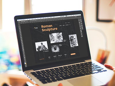
Do you prefer dark or light interfaces? Do you give any of color schemes your preferences in UI design projects? Today's shot captures the concept of Museu landing page and applies dark background. And traditionally for Friday, it presents you the set of articles from Tubik Blog this time devoted to the issues of color choice in UI design. Are you on the dark side or on the light one?
Light and Darkness in UI Design. Matter of Choice.
Dark Side of UI. Benefits of Dark Background.
Color in UI Design. Look on the Bright Side.
Color Theory: Brief Guide For Designers.
Color in Design: Influence on Users’ Actions.
Join in, welcome to read and let us know if you want to see some particular topics explored in Tubik Blog. Nice upcoming weekend to all the dribbblers!


