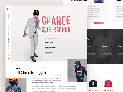
Chance the Rapper – Landing Page
Wanted to explore a redesign for Chance the Rapper's web site (chanceraps.com). I felt like his site would function better as a single page layout with the ability to stream his music while reading more about him, purchasing tickets and buying merch (more details on design thought below).
Over the next few weeks, I am going to continue to publish redesigns of my favorite bands, products, and services.
So give this a like, follow me, hit me up on Twitter. Would love to hear what you think! Thanks!
-----------------------
Since most Dribbble shots don't show the designer's thoughts, here are some of mine for this project:
– Chance is becoming more mainstream since winning Grammy's and performing on SNL/Jimmy Fallon/etc. Wanted to include an about section for site visitors wanting to learn more about him, as a person and as an artist.
– Continuing down the page from there, the user might have only heard a song or two so I felt like it would be important to showcase his music.
– Once the user listen to more of his music, they will obviously become a fan because Chance's music is just that good. When I hear a great band or artist for the first time, the first thing I do is check to see if they will be touring near my city. So the next section would display his upcoming tour dates.
– The last section of the page would showcase his merchandise. Currently on his website, the merch is just displayed in a long scroll page, requiring the user to click into the product before adding it to their cart. Wanted to simplify the selection process, give filtering options, as well as the ability to add to the cart straight from the landing page.

