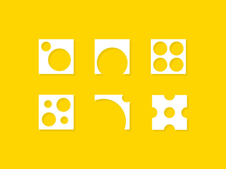
Principles of Design: Icon Set
Principles of Design
BALANCE Balance in design is similar to balance in physics. A large shape close to the center can be balanced by a small shape close to the edge. Balance provides stability and structure to a design. It’s the weight distributed in the design by the placement of your elements.
PROXIMITY Proximity creates relationship between elements. It provides a focal point. Proximity doesn’t mean that elements have to be placed together, it means they should be visually connected in someway.
ALIGNMENT Allows us to create order and organization. Aligning elements allows them to create a visual connection with each other.
REPETITION Repetition strengthens a design by tying together individual elements. It helps to create association and consistency. Repetition can create rhythm (a feeling of organized movement).
CONTRAST Contrast is the juxtaposition of opposing elements (opposite colors on the color wheel, or value light / dark, or direction – horizontal / vertical). Contrast allows us to emphasize or highlight key elements in your design.
SPACE Space in art refers to the distance or area between, around, above, below, or within elements. Both positive and negative space are important factors to be considered in every design.
Descriptions borrowed from J6 Design (www.bit.ly/1EORx53)
This is a submission for The Prompt series. Check out the original Prompt here>> www.bit.ly/2pyvxud
