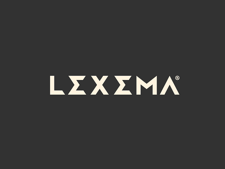
Lexema Type
Typography I've made for Lexema® logo. I think maybe it needs some refinement and would be awesome hear from you guys some tips and tricks to make it perfect :)
This will follows the previous triangular mark with some new colour pallete yet no defined, I'll present it soon as well!
Feedback is much appreciated
More by Breno Bitencourt View profile
Services by Breno Bitencourt
Like
