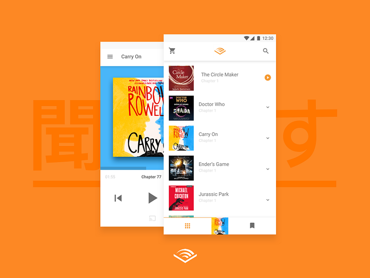
Audible Android
My biggest problem with Android is: Companies doesn't seem to care like they do on iOS. Apps are shitty, apps are not getting updated designs and so on. The biggest problem is Audible I think, since the design looks like they try to cover Android 2.3 and Material at the same time. So I try to see how I would do it.
- Be angry about why the current Audible-designers won't listen - Use the Material Design Tab Bar to create more engagement - Use Colors that are on par with the current Brand Identity - Focus on core features instead of giving too many options - Use the burger-menu on the player-screen for chapters instead of navigation (biggest UX fault to date but heck I love it)
Let me know what you think! (That word in the background is "listen" in japanese. Why? Because I hope they do!)
