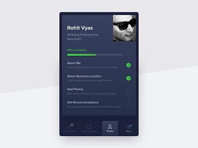
Partner profile visual exploration
This is one the earliest explorations I did for UrbanClap Partner profile. Our team was divided between dark and light theme.
Tell me which one would you pick and why?
Check out real pixels as well.
Cheers!
More by Urban Company Design (formerly UrbanClap) View profile
Like

