AMURV
Objective: To create a brand identity for AMURV to use in advertising campaigns for their candies.
Opportunity: AMURV is located in a natural environment with sustainability at the heart of the campaign.
Idea: Create a brand identity inspired by nature and sustainability whilst remaining a low-cost package, by using a label with easy application.
ABOUT THE PROJECT
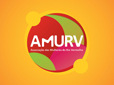
Visual identity creation and adhesive label packaging for AMURV (Associação das Mulheres do Rio Vermelho), who focus on developing agricultural industry products and natural ingredient candies.
The client requested a cheerful and modern brand identity to be designed, which would be used on the expansion process of its products in the mid-western region of Brazil. This identity would focus on the natural and healthy attributes of the products, the sustainable values of the association and Fair trade status.
The creation began by applying a simple font to the AMURV initials, but also customizing its forms by using rounded corners and the transformation of the letter M (with a shape that refers to the rivers and mountains from the region). The association name was applied in a circular shape, giving weight to its application and the transmission of cooperative and sustainable production values.
By using colors and motifs inspired by the Brazilian mid-west region and attributes of the natural candies, the result was a cheerful and lively brand. The typography was chosen considering readability and the easy access to it, since it is a very modest association. The packaging has also designed to be low cost, so it was created an adhesive label that adapts to different materials and formats.
