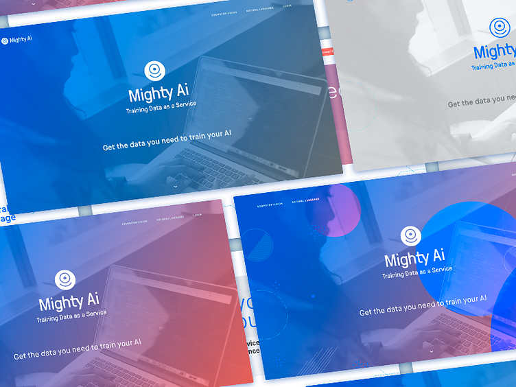
Mighty AI Website Mockups
Few months ago we were designing a landing page for the launch of Mighty AI, so I explored a few different (but similar) options around color. Trying to "exhaust the options" in order to get an idea of what we might want to do, and we ended up going with something similar to the top left version.
More by Peter Bentley View profile
Like
