Stuck in a new project
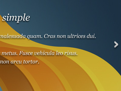
I am stuck in this particular design. The orange radial at the back is the company logo and the client wants to have both text and the bg to be visible clearly.
If i make the text clear the bg needs to be darkened and it looses its depth. Tried adding a gradient but it came out bad.
If i leave the text as it is on the bg then the text is not as visible as i would like it to be....
HELP!!!
More by Sidharth Rajah View profile
Like
