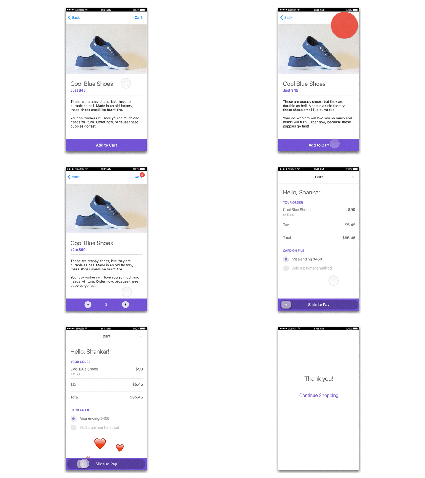
Checkout flow
Just a checkout flow. Could functional animation help with minimizing interactions and bring delight? Here, I tried to use the button for adding item to the cart but also as a counter once you have 1 piece of the item. Also, I am hoping that some literal animation - like the throwing the product image to the cart as the user presses the Add to Cart button – can help bring attention to the cart itself. Finally, the hearts on the payment screen are a way to express gratitude.
More by Shankar View profile
Like
