Timbuk2 Rebrand
Three years ago we worked with classic San Francisco bike messenger bag brand Timbuk2 to help evolve their brand for an ever expanding array of awesome products. Timbuk2 truly represents the essence of the bike — freedom, energy and the exhilaration that can only be completely felt in an urban environment. An evolving product line gave them the opportunity to branch out into uncharted territory — bringing the spirit of cycling to every other aspect of city life. Our challenge was to unite the brand across current and future collections — allowing each to express their own unique personalities.
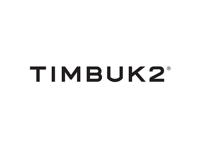
Re-evaluating Timbuk2’s logo in light of the brands re-invention, was the beginning of our process. While there was history in the original mark, the typography and lock up told the story of the gritty San Francisco bike messenger culture of the 90s. It became clear the logo was polarizing—preventing many from embracing the brand, and competing with the diverse focus of both current and future collections. To allow all of the products to reach their potential, a simplified word mark liberated of the swirl icon, was deemed necessary.
It was clear that a vital part of the new logotype would be to capture the relentless spirit that is at the core of this brand. Timbuk2 is a playful company, and we wanted to retain this unstoppable energy and history with every aspect of the redesign. The letterforms are unique—inspired both by the mechanical process of engraving numbers on a bike, and the wide, confident typography emblazoned on San Francisco’s street signs.
A typographic system with large families of coordinating fonts was developed keeping maximum flexibility in mind. Examples demonstrating ideal scale, alignment and spacing were documented in an extensive standards document. As Timbuk2’s design roadmap, the standards lead the way for all succeeding design decisions—in-store, online, with packaging and on product.
Additionally, the new logotype is painstakingly minimal. This grants it a crucial flexibility, allowing it to be applied across all product lines—each collection shining with its own personality.
