Bridge Logo Construction
I loved working on this concept so I wanted to share with you the grid behind it.
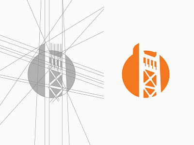
Since the logo itself is in perspective the grid needed to reflect that. We are seeing everything from worm's eye view, or in other words from bottom up. So the lines needed to be irregular a bit, meeting on the horizon line at the left side. And of course they have a focus point at the top as well. The entire design is finished up by being enclosed inside a circle.
Finally the color orange was based on a very pale color that client previously used- it lacked impact and didn't draw attention, so I went with a stronger tone for it to give it that final nudge.
