Della Costa
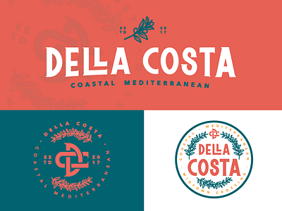
Final Branding for Della Costa. Aiming to bring the essence of indulgent, oceanic dining to Omaha meant creating a logotype by hand that evokes the imagery of the Italian/Mediterranean Coast. Wine labels and stamps lent a firm hand in the conceptualization process, and the result is a romantic modernization of older typefaces combined with the use of monograms. When it came to symbolism, only one icon could wholly encompass the heart of the Mediterranean: the olive branch.