Unlaced Enhancements


One my favorite apps is unlaced -- an app that aggregates news, release dates and shoe store information all in one place for sneakerheads. I check it at least once a day, as it saves me from checking several sneaker blogs individually -- such a convenience!
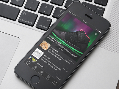
One thing that I've never understood though is navigation pattern the app uses. The initial screen loads "featured" news stories and a large, grid-based navigation. However, when you want to change sections, you always need to return to the home screen first -- it feels like such a clunky experience.
I tried to reduce this friction by adding a navbar at the bottom. The app would open to the news page, with featured stories still prominently placed at the top. I decreased the height of the standard news story previews and rearranged their contents, allowing more to be displayed on the screen at one time. I also added a new universal 'settings' tab that would control settings for all 4 sections in one location, instead of compartmentalized inside of each section.
Any other sneakerheads out there that love this app and check it daily? Let me know what you think!
Full pixels and a comparison attached.