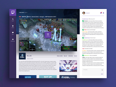
Twitch Redesign
Twitch is one of my favourite websites. I watch it every day and therefore I felt the need to redesign the current UI, because there's some issues that I think need to be solved. In the current website, the video (which is the primary feature i guess) moves below the fold and the navigation is very crowded. It confuses me.
So here are my 2 cents that hopefully spark a redesign at www.twitch.com. The site that i love so much.
I've also added the .sketch file so people can start experimenting themselves. Have fun with it and press that 'L' button!
twitch_redesign_def.sketch
9 MB
More by Remco Bakker View profile
Like

