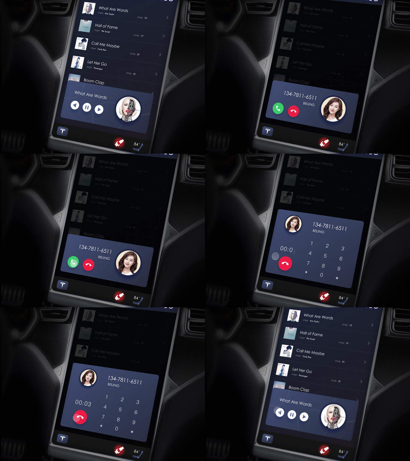
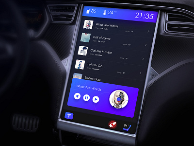
Tesla car interactive concept
Thanks @Robert Anitei for giving me the advice in my last work. Too bright colors really affect the driver's attention, and the driver's attention should be on the driving. All the screens have a dark tone, but the color of the button should be so easy to find. Interactive effect is fun but not too much to attract the driver's eyes.
Hope you like it bros! Press "L" on your keyboard if you do, and follow me if you don't want to miss some upcoming work.
My project
More by UIGREAT Studio View profile
Like


